
Colour themes
Change the colours SnazzyFoto is drawn in: Dark, Light, Midnight, High contrast, Paper, Brutalism or your own colours. A Supporter feature; the free version uses Dark.
A theme sets the colours SnazzyFoto itself is drawn in: dark for a dim room, light for daylight, high contrast for easy reading, or your own colours. It changes the app only — never your photos. Supporter
The free version uses the Dark theme; the other themes and your own colours are unlocked by a Supporter donation (see In the free version).
Pick a theme
There are two places to choose a theme:
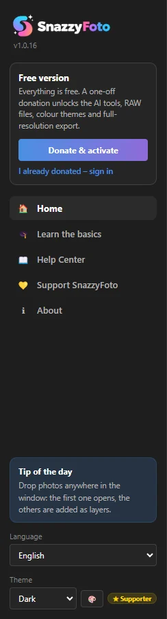
- On the Home screen — the Theme menu at the bottom of the side bar. Pick a theme and it changes at once. The 🎨 button next to it opens the Appearance window.
- In the Photo Editor — View › Appearance & custom colours… (also in Edit › Preferences) opens the Appearance window.
 1
SnazzyFoto remembers your theme and opens in it next time. The theme is for SnazzyFoto on this computer: every module and every photo you open uses it.
| Theme | What it is like |
|---|---|
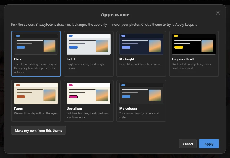
| Dark | The classic editing room. Easy on the eyes; photos keep their true colours. This is where SnazzyFoto starts. |
| Light | Bright and clean, for daylight rooms. |
| Midnight | Deep blue dark for late sessions. |
| High contrast | Black, white and yellow; every control outlined. Easiest to read. |
| Paper | Warm off-white, soft on the eyes. |
| Brutalism | Bold ink borders, hard shadows, loud magenta. |
| My colours | Your own colours, corners and style (see below). |
What they look like
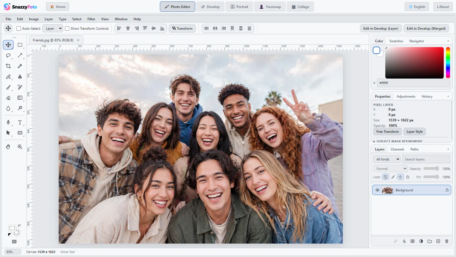
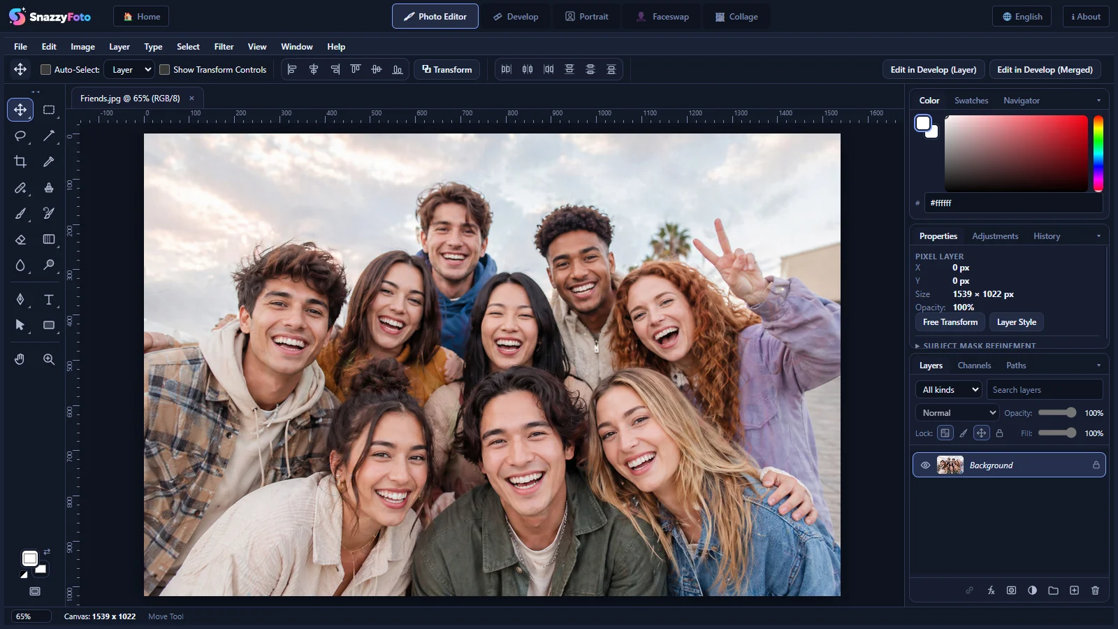
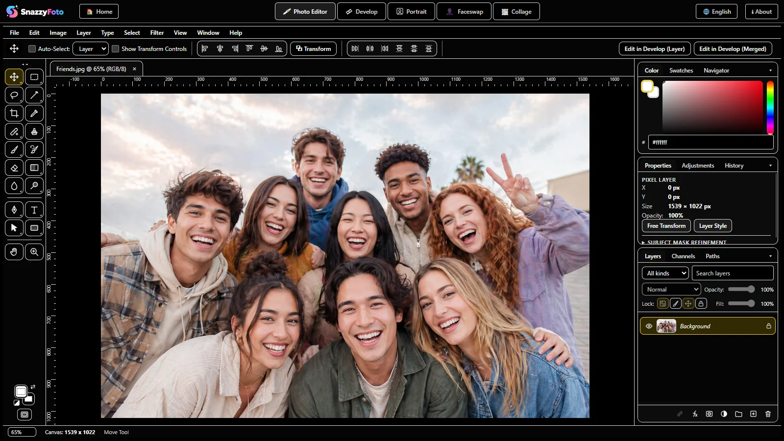
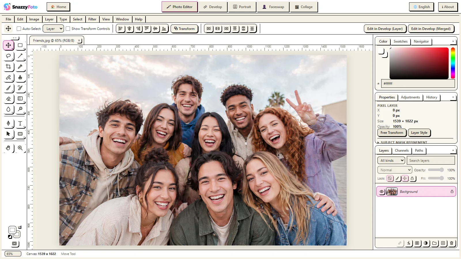
For judging the colours of a photo, a dark or neutral theme is best: bright or colourful surroundings change how you see the colours in the picture.
The Appearance window
 123
- 1 Every theme with a small picture of it. Click one to try it: the whole app changes behind the window straight away.
- 2 Make my own from this theme — starts your own colours from the theme you clicked.
- 3 Apply — keeps the theme you tried. Cancel (or Esc) puts the old one back.
Make your own colours
- Open the Appearance window and click the theme closest to what you want.
- Click Make my own from this theme. My colours is now selected, with that theme's colours, and the settings below appear.
- Change the colours, the corners and the style (see the list below). Each change shows at once.
- Click Apply.
 1234
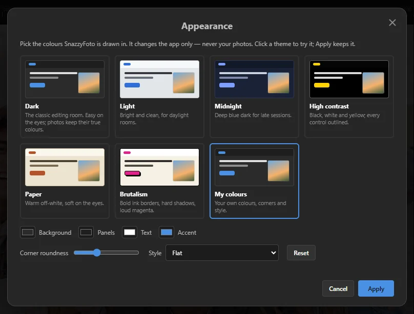
- 1 Four colours. Click a square to pick a colour:
- Background — the window behind and between the panels.
- Panels — the panels and bars; the other shades are worked out from this one.
- Text — words and icons.
- Accent — the main buttons, selected items and highlights.
- 2 Corner roundness — from square corners (left) to round ones (right).
- 3 Style — the shape of things: Flat, Brutal (ink borders, hard shadows) or High contrast (outlined).
- 4 Reset — back to the starting colours of My colours.
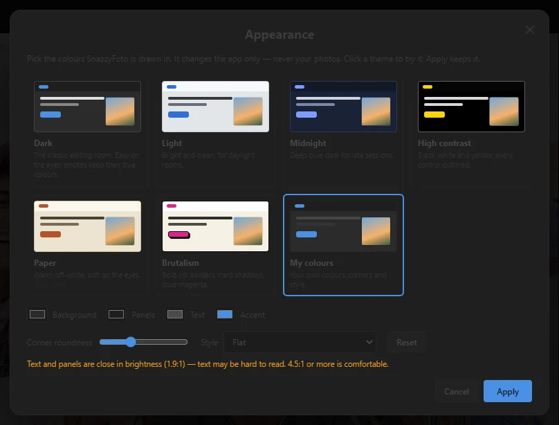
"Text and panels are close in brightness"
If the text colour is too close to the panel colour, a warning appears under the settings:
 12
The number is the contrast ratio. At 4.5:1 or more, text is comfortable to read. Make the text lighter or the panels darker (or the other way round) until the warning goes away.
In the free version
Colour themes are a Supporter feature, so the free version shows Dark. A ★ Supporter label sits next to the Theme menu on the Home screen, and in the Appearance window every theme except Dark has a 🔒. You can still open the window and look at the themes, but they don't change the app.
If you choose another theme on the Home screen, or click Apply with a locked theme, SnazzyFoto shows this window and stays in Dark for now:
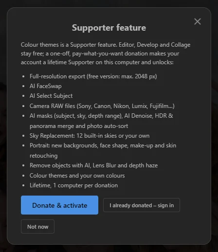 123
- 1 Donate & activate — opens your browser to donate and unlock this computer.
- 2 I already donated – sign in — signs in with the account you donated with.
- 3 Not now — closes the window and keeps Dark.
A theme you pick in the Theme menu on the Home screen, or apply in the Appearance window, is remembered (your own colours too), even though SnazzyFoto stays in Dark: as soon as this computer is activated, it switches to that theme by itself. A theme you only tried — clicked and then left with Cancel — is not kept. See Free and Supporter for how donating works.
If this computer's licence stops being active (for example because you unlinked it on the website), SnazzyFoto shows Dark again. Your theme comes back by itself as soon as the computer is activated again.